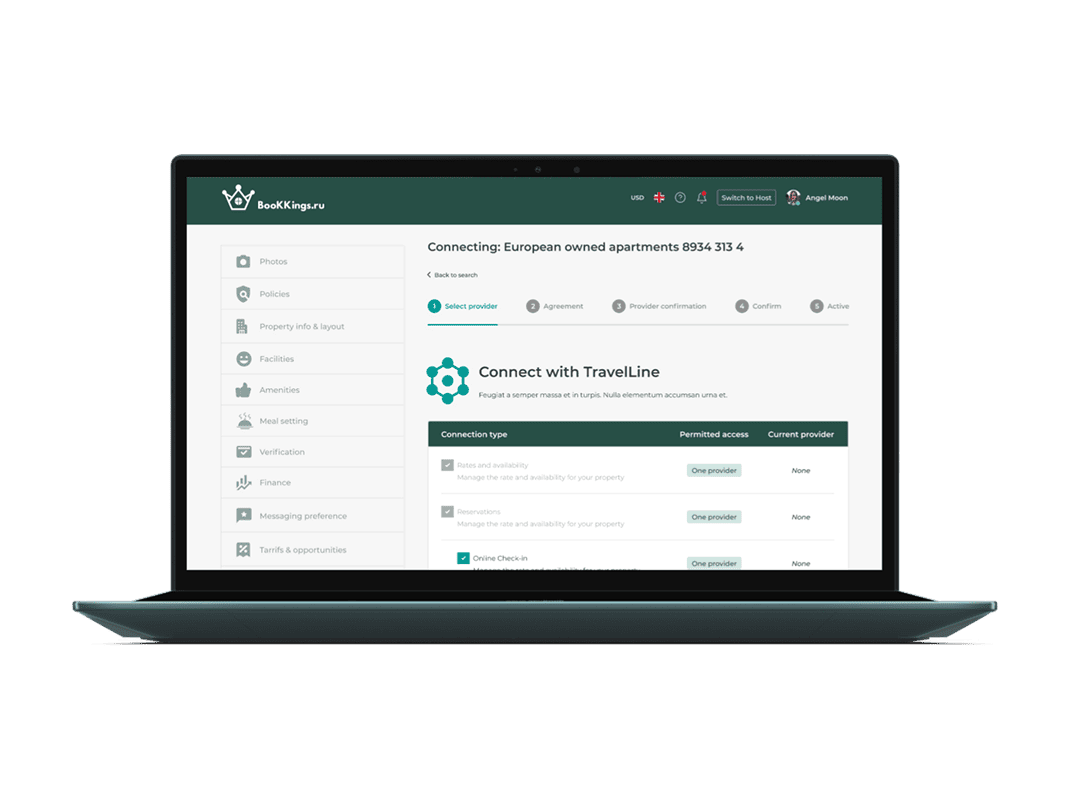
A B2B & B2C platform where travelers can book hotels easily, and businesses can list their properties to reach more guests.

Aleksandr was building a travel booking website similar to Booking.com and needed a designer to take his basic mock-ups and turn them into a professional, user-friendly design. The goal was to create an intuitive platform where users could easily search, compare, and book accommodations.
This project required a strong focus on usability, clean design, and seamless navigation to ensure a smooth booking experience for travelers.
UX/UI Designer
The client, Aleksandr, had an initial travel booking website mockup, but it lacked a polished design, clear navigation, and engaging user experience. The interface needed significant improvements in usability, structure, and aesthetic appeal to align with industry standards. Additionally, the booking process was not intuitive, and the site required a strong design system for consistency across all pages. The challenge was to enhance the existing wireframes, ensuring they provided a smooth, professional, and efficient user experience while maintaining a visually appealing and trustworthy design.
I collaborated closely with the client to enhance the website’s structure, usability, and visual hierarchy. The solution involved:


Every great project starts with a clear vision, and this one was no different. Aleksandr had already created a basic mockup for his travel booking website but needed help making it professional, modern, and user-friendly. His goal was to build a platform similar to Booking.com but with a unique touch that would make searching and booking faster and easier.
To get started, I carefully reviewed the first ten pages of the mockup he shared. I focused on how users would navigate, how information was displayed, and how smooth the overall experience felt. It was important to ensure that users could search, compare, and book their trips without any confusion.
After going through the mockup, I had a conversation with Aleksandr to understand his business goals, target audience, and must-have features.
We also looked at popular travel websites to see what worked well and what could be improved. Based on this, I put together a plan for improving the layout, visuals, and user flow to make everything more intuitive and visually appealing.
I moved on to the high-fidelity design phase, focusing on refining visual aesthetics, user interactions, and overall usability. I iterated on several key elements based on feedback from the client:
I ensured that the color palette aligned with the brand’s identity, balancing warm and inviting tones with a professional look. The typography was adjusted for readability and clarity, ensuring consistency across all pages.
Since travel websites require fast and efficient search functionality, I optimized the search bar placement, filter categories, and sorting options to make it easier for users to find the perfect accommodation.
The “Book Now” and “View Details” buttons were made more prominent with strong contrast, guiding users smoothly through the booking process.
Proper alignment and spacing were refined to create a clean, organized, and visually appealing layout, reducing clutter and making key elements stand out.
Given that a large percentage of users book travel on mobile devices, I ensured the designs were optimized for seamless navigation across different screen sizes.
With the foundational UI elements refined, I proceeded to develop high-fidelity designs that brought the platform to life. The final UI featured:


To ensure a smooth transition from design to development, I prepared a comprehensive developer handoff package that included:
This structured approach minimized inconsistencies and sped up development, leading to a flawless final product that matched the intended design vision.

This project was a great experience because it showed me how small design changes can make a huge impact on user experience. One of the biggest lessons I learned was that travel websites need to be both beautiful and highly functional—users want a smooth, no-hassle experience when booking trips.
Working closely with Aleksandr also reinforced how collaboration and feedback play a big role in creating a successful design. Every time I refined something—whether it was the search bar, navigation, or filtering system—his input helped make it even better. This back-and-forth process ensured that the final design was something both user-friendly and visually polished.
Another key takeaway was the power of simplicity. Travel websites often have a lot of information, and it’s easy for things to feel overwhelming. By using clean layouts, clear buttons, and intuitive navigation, I was able to create a design that felt light, organized, and easy to use.